Friday, November 4, 2011
Sunday, October 2, 2011
Monday, July 18, 2011
Thursday, June 23, 2011
Saturday, June 18, 2011
Thursday, June 16, 2011
Wednesday, June 15, 2011
Monday, June 13, 2011
Monday, June 6, 2011
"Illustrations portfolio"
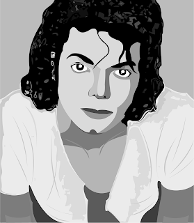
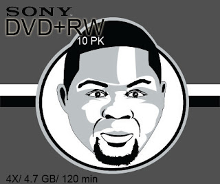
I am starting to put up some of the illsutrations i have made in my free time! i hope you enjoy...slowly but surely i am going to get better @ this!
Sunday, April 24, 2011
The specialty piece
The decision for this piece was to redesign the little menu sheet that they give to a customer every time he goes and order to go. So i was pretty much dealing with their actual speciality piece. It feels a bit of a challenge to redesign a menu, as you may have to keep it interesting to read, clear, appealing, appealing....i have decided to keep it quite simple, easy to read and have a typeface, Bolonewt, which seemed like a type that mixes fun and business at the same time, so i kinda got caught and chose it as type for the menu.
Earth day poster....
the challenge right here was to figure out how Buns and Shakes could contribute in its way to Earth day. So the idea was to come up with a special menu offered on that day by the restaurant.
Again i felt more comfortable illustrating, i think i discover that i am more of an illustrator than a photoshopper. After coming up with the illustration was the challenging step of finding the right type. To me, type may come up as the very last step of a work and can be the part that would involve more thinking than coming up with the idea itself.
so far here is what i came up with.
Tuesday, March 29, 2011
Sunday, March 27, 2011
Revised Stationery layout
Here is a revised and final version of the stationery set.i came up with some slight modifications on the letter head and the paper color and choice as well. White is going to be the color and the stripes are going to be printed out on its backpage to have this ''wrapped around'' feeling just as the business card...I think this looks better than the previous version.
Saturday, March 5, 2011
The Stationnery...
This one personally looks like a challenge to me...i thought and came up with couple ideas about how i was going to design those items and here are couple results...i am going to stick with a main idea of stripes or any sort of forms and shapes that represent the 3 colors of the logo.
Sunday, February 20, 2011
7 words...I need to find a font for you guys!!!
So i found fonts that could in my opinion the words that are listed, i can say scultural and function have been the most challenging words to me and after a long time researching i found something that would make the deal.
I had most of my typefaces from dafont.com excpect for the Impact type used for powerful that was already in my system.
Here is a list of the typefaces names.
Shape: Girls are weird
Form: Angled
Function: Digital-7
Color: Flim-Flam
Sculptural: Kingthings Extortion
Sexy : Kunstler Script
Powerful: Impact
Thursday, February 17, 2011
Some Color choices...
I think the color choice part of a logo design is as hard (or a bit less harder) as creating the logo itself, colors must be chosen wisely for the logo to be successful.Lots of risks are involved as bad colors can have a well designed logo turn into a failure...tough!
Sunday, February 13, 2011
Hand drawing vs Digital Illustration
I love drawing, especially figures and characters, my best way of practice is using my own pictures and trying self portraits because i dont mind having a funny representation of myself, so far i never had a "formal" drawing class in which i could learn about every single and successful technique for figure drawing and every tips and tricks of "life" or "realistic" drawing. so far my Life Drawing class taken in Spring 2010 pretty much helped me understanding a little better about some figure drawing techniques. i would really like to be taught all the way from A to Z about realistic drawing to enhance my skills.
Digital illustration is also a field that raised my interest and that i've started exploring lately...it is really interesting as i learn about tracing and mastering the pen tool (which was a mystery to me not long ago). It also involves observational skill and precision and i think i need keep exploring these fields as they are really "interests raisers". Balancing both of these skills is something that i find really interesting and i really hope that they could open doors for me someday.
Wednesday, February 9, 2011
Sketching the logo...
Here are some of the sketches that i have been doing for the client
The 3 following ones are the potiential logos that i am going to explore.
The 3 following ones are the potiential logos that i am going to explore.
My Favorite work from the Intro to GRD class
Here are some of my work from the intro to Graphic design class that i consider the best i have done so far.
Book cover design
Package Redesign
Poster Design
Package Redesign
Monday, January 24, 2011
Examples of clients for logo redesign
http://www.menswearhouse.com/webapp/wcs/stores/servlet/Menswear_-1_10601_10051_10051_10051_Menswear.html
http://www.yelp.com/biz/buns-and-shakes-atlanta
http://www.midtownbowl.com/
Sunday, January 23, 2011
Good vs Bad logos
Here are my 5 examples of good logos. though simple, they have achiveed the effectiveness challenge and have gained instantly and overtime the public's interest and are easily identified. These logos are also a perfect identificaiton of the brand and so far a change would be unecessary.
But here, we have my examples of bad logos, though they were not intended to be bad, they are just inappropriate as regular logos as they trigger a sense of "being visual" or display another message that is totally oppsed to the intended one. These logos definitely needs some retouching as they would give a better identification of the companies that uses them.
Subscribe to:
Posts (Atom)


